Download Inlow Fonts Family From Eugene Bunin

Download Inlow Fonts Family From Eugene Bunin
Download Inlow Fonts Family From Eugene Bunin Download Inlow Fonts Family From Eugene BuninDownload Inlow Fonts Family From Eugene Bunin


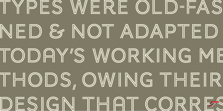
Inlow is a font that evokes a sense of retromodernity, aesthetics, and something perfect. When developing it, I wanted to convey a touch of retro design and modern design. It can be used in the design of posters, logos, covers, Instagram, just in the text and many other ideas, all just border on your ideas. I think I can see this font on the covers of books. It's exciting.

Inspirations were book covers and cars from the 60s and 80s. I wanted to convey retro and modernism.


The use of the font is unlimited, and the support of many European languages and not only gives a huge scope for creativity!


Design By Eugene Bunin.


Download Inlow Fonts Family From Eugene BuninDownload NowView Gallery


Download Strikt Fonts Family From NaumType

Download Strikt Fonts Family From NaumType


Strikt is a variable modular font family with 2 axes, build on a 3x3 grid. It was designed by Peter Bushuev and released in August of 2020.


It was inspired by the idea of utilizing the variable font technology to make a font with build-in animation potential.


Strikt has 2 variable axes: weight and animation. 

The first one is self-explanatory, but the animation axis is the main feature of the font. It allows you to morph any glyph to a 3x3 dot array and back.

In Strikt Plus modification, this array is the same for each letter, which gives the possibility to transform one glyph to the other.


Strikt is also a very sturdy but unique display font. In "Plus" modification it gives even more sci-fi and techno vibes. And in light weights, Strikt becomes more architectural and gives the possibility to make unusual ornamental layouts.


Get Strikt to jazz up your design! Try variable versions for kinetic typography and motion graphic. Strikt is a bold choice for posters, album covers, experimental identity and packaging, games, and editorial design.


Download Strikt Fonts Family From NaumType


Download SK Fencer Fonts Family From Shriftovik

Download SK Fencer Fonts Family From Shriftovik


SK Fencer™ is a typeface inspired by the fine art of fencing. Its light linear features contrast with the angular thicknesses, creating a unique image of the font and influencing its behavior in the line. Using alternative uppercase characters, you can implement a lot of typographic ideas that will decorate your design. A large selection of weights will also be a great help in your work. The SK Fencer typeface is suitable for both headers and small text arrays, and its widest set of glyphs supports both extended Latin, Cyrillic and many other languages. SK Fencer – elegant, practical, dynamic, unusual!


Download SK Fencer Fonts Family From Shriftovik


Download Katerina P Rounded Fonts Family From NicolassFonts

Download Katerina P Rounded Fonts Family From NicolassFonts
Download Katerina P Rounded Fonts Family From NicolassFonts Download Katerina P Rounded Fonts Family From NicolassFontsDownload Katerina P Rounded Fonts Family From NicolassFonts


Katerina P Rounded was designed by Nikolay Savchuk. Katerina P Rounded is a modern versatile sans-serif typeface. What differentiates Katerina P Rounded from the other fonts is an exceptionally distinctive design. It is brilliantly suited for graphic design and display use and perfect for logotypes, t-shirts, packaging, brand identity, books, magazines, newspapers, posters, billboards, and advertising.


Download Katerina P Rounded Fonts Family From NicolassFontsDownload NowView Gallery


Download Airco Std Fonts Family From Typofonderie

Download Airco Std Fonts Family From Typofonderie


Designed between italic and script styles


Airco is a typeface designed between italic and script styles. The letterform finish is rounded. Designed ultra slanted (27°), the shapes evoke a fast and assertive movement. The result is a human typeface, dynamic, that will visually work well in technology and sport, without ever being dry, rigid or dehumanized. The structure of the letters is influenced by Renaissance italics, at the difference that in the case of Airco, the lowercases and capitals are visually homogeneous thanks to the giants lowercases. In fact, the default numerals can be used in capital as well lowercases settings.


Download Airco Std Fonts Family From Typofonderie


Download Audace Std Fonts Family From Typofonderie

Download Audace Std Fonts Family From Typofonderie


Between geometry & shapes inspired by nature, in 4 fonts


Audace was born as a response to a simple brief: how to visually express human interaction and technology with abstract forms? The starting point is a humanistic sanserif, to which are added external references: design pieces, furniture, buildings. Architects shape our world with the intention to reconnect nature, human and address a perfect functionality. Not so far to typeface design which combines a personal vision and ensures good legibility in a certain context.


Audace — like the works of those artists, designers, architects — is clearly influenced by the tension of the line, the play with negative space, the dynamics, the surprise, the nature that will influence the shapes of the letters. So if a v is asymmetrical, and the y based on similar asymmetry but in reverse, these two shapes help to distinguish from one to the other. This is a consequence of the influence of forms from design and art in the design of the Audace. And this small example illustrates the confrontations of the designer’s influences: the search for the most unique shapes, but without compromising on function: to be read, to be legible, even at very small size in the worst conditions.


Audace, between geometry and shapes inspired by nature


Download Audace Std Fonts Family From Typofonderie


Download AW Conqueror Std Inline Fonts Family From Typofonderie

Download AW Conqueror Std Inline Fonts Family From Typofonderie

Download Now
Server 1
Download Now
Server 2
Download Now
Server 3


30s inspired geometric inline display typeface


Several titling typefaces made their appearance at the start of the 20th century, notably Acier and Bifur, both created by French poster artist Cassandre. Later, in the Netherlands, S.H. de Roos designed a version of Inline for its Nobel family called, naturally, Nobel Inline. AW Conqueror Inline pays homage to this beautiful version.


AW Conqueror superfamily

AW Conqueror Didot is part of a larger family, who include 4 others subfamilies with great potential: They’re but based on same structure, with some connection between them (width for example), to offer a great & easy titling toolbox to any designers, from skillful to beginner. Each of the members try their best to be different from the others because of their features. They should work harmoniously in contrast.


Club des directeurs artistiques Prix 2010

European Design Awards 2011


Download AW Conqueror Std Inline Fonts Family From Typofonderie


Download AW Conqueror Std Inline Fonts Family From Typofonderie